Illustration
Our illustration style is built from simple shapes, clean lines, and limited color. These characteristics give our illustration a consistant look and make it easy to digest and understand at a glance.
Construction
Simplified Construction
Illustrations are constructed using basic shapes and flat color.
Use of White and Negative Space

White is used strategically to allow more interplay between foreground and background.
Types
Spot Illustration

Used in smaller moments, usually paired with copy as visual aid so that the content can be easily understood.
Badges

Badges are quick-read / literal illustrations focusing on one main idea. They are primarily optimized for email at 88x88px
Color Palettes
Primary
100%
50%

Pantone 300
CMYK: 100 / 62 / 7 / 0
RGB: 0 / 92 / 185
HEX: 005CB9

Pantone Cool Gray 9
CMYK: 56 / 47 / 44 / 10
RGB: 118 / 119 / 123
HEX: 76777B

Pantone 285
CMYK: 91 / 43 / 0 / 0
RGB: 0 / 124 / 193
HEX: 007CC1

Pantone Black 6
CMYK: 82 / 71 / 59 / 75
RGB: 17 / 24 / 33
HEX: 111821
Secondary (Minimal Use)
100%
50%

Pantone 361
CMYK: 75 / 5 / 100 / 0
RGB: 63 / 172 / 73
HEX: 3FAC49

Pantone Orange 021
CMYK: 0 / 80 / 100 / 0
RGB: 240 / 90 / 34
HEX: F05A22

Pantone 266
CMYK: 68 / 85 / 0 / 0
RGB: 110 / 72 / 156
HEX: 6E489C

Pantone 1235
CMYK: 0 / 30 / 100 / 0
RGB: 252 / 184 / 19
HEX: FCB813
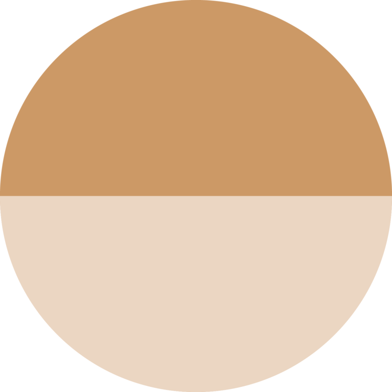
Specialty Colors (Illustration Use)
The specialty colors are designated only for illustrations, icons, and graphs that require variations of tone and opacity.
100%
50%

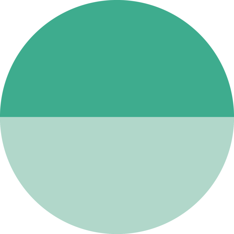

100%
50%

Illustration Applications
Examples of graphic layouts are for tone and attitude only. Specifics are subject to change during development based on technology and usage.

Illustration Summary
01
Simple, bold, concise
02
Use white for dynamic compositions
03
Keep color palette to minimum

