Typography
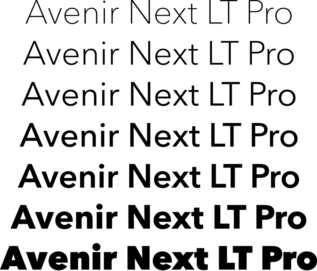
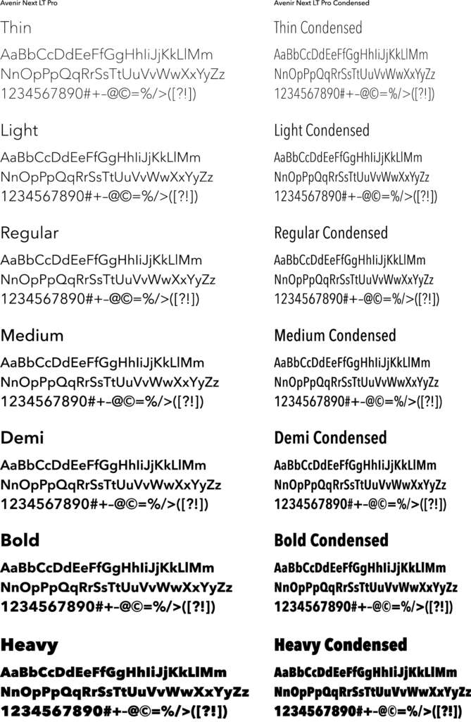
Avenir Next LT Pro
Avenir may be used for both headline/subhead, captions, pull quotes, sidebars. Avenir should be used for all body copy. Avenir Condensed may be used for headlines, pull quotes, captions, and chart / graph labels, especially where space constraints are present.
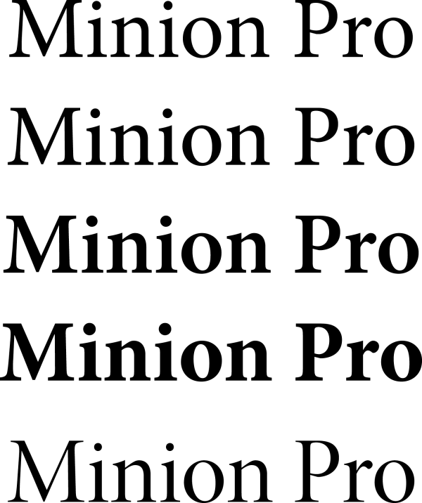
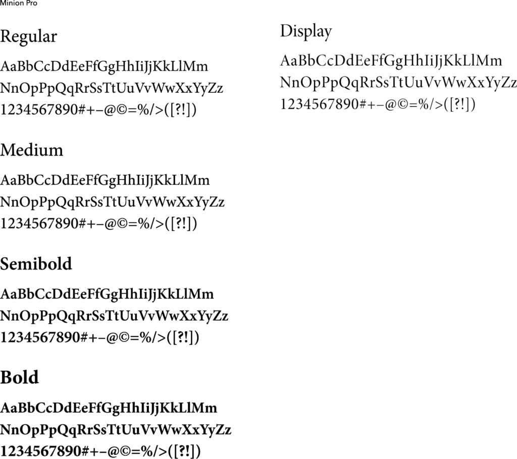
Minion Pro
Minion Pro may be used for body copy, captions, pull quotes, and sidebars
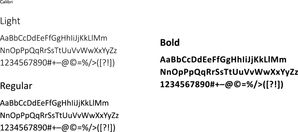
Calibri
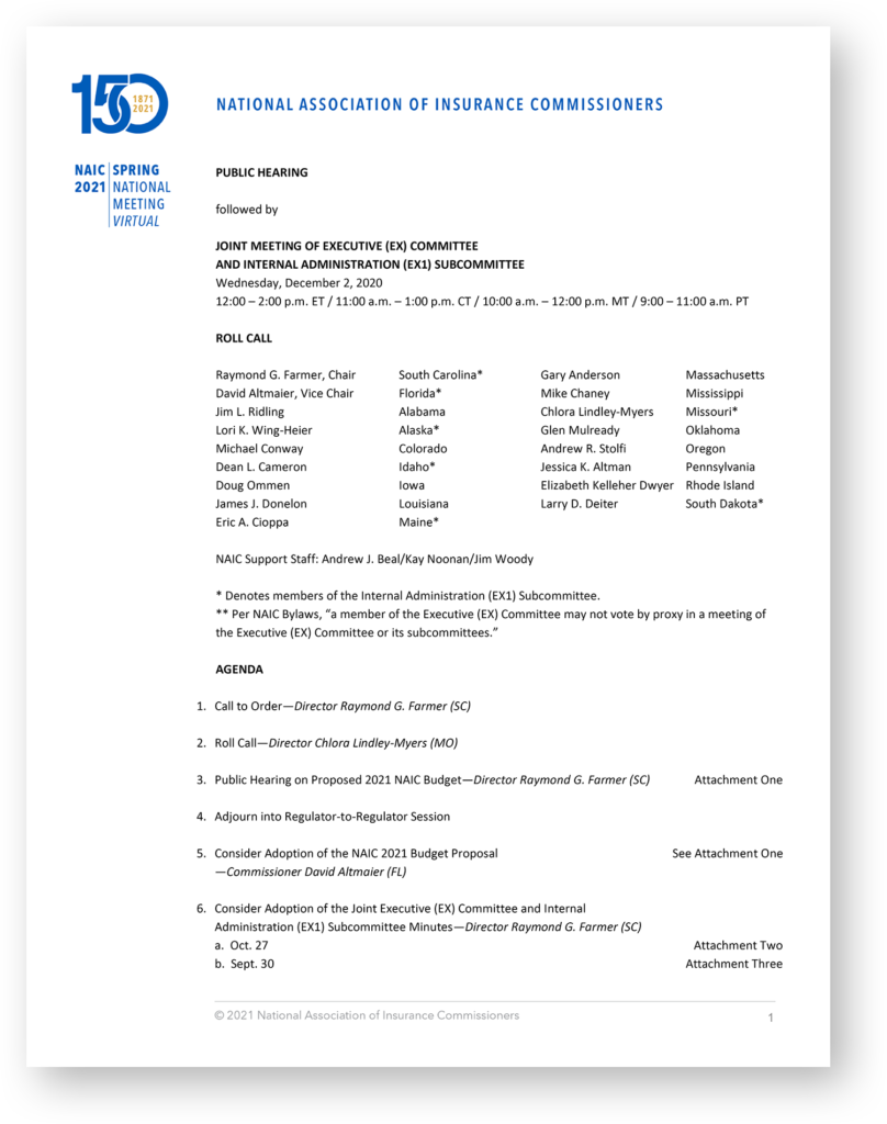
Calibri is used when Avenir Next LT Pro and Minion Pro are unavailable. In some cases, templates and sample documents created with Microsoft Office products should use Calibri for text that will be editable. Elements in these types of files that will not be edited (such as Headers, Footers, and Illustrations) can be created using Avenir Next LT Pro or Minion Pro and inserted as images.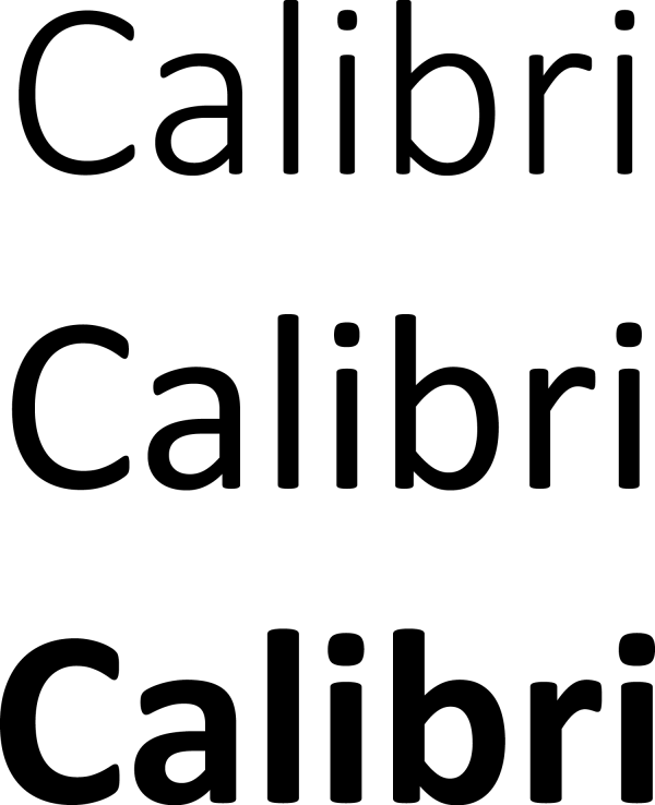
Pairings
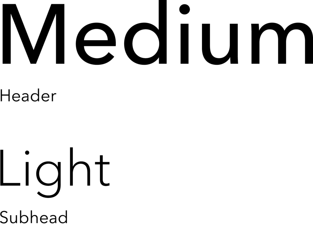
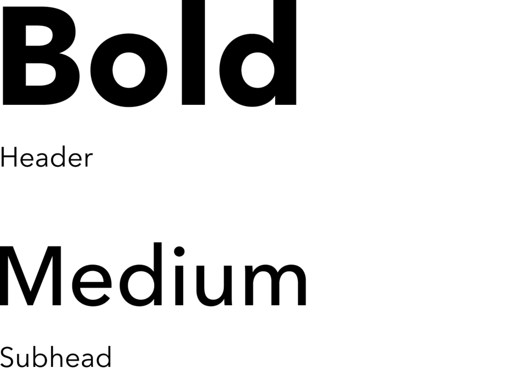
It is important to maintain pairings that allow for clarity, consistency, and a strong hierarchy for all communications. Pairings shoud be two weights apart. Generally the subhead should be half the point size of the headline.
Option 1
Option 2
Hierarchy
Headline and Subhead
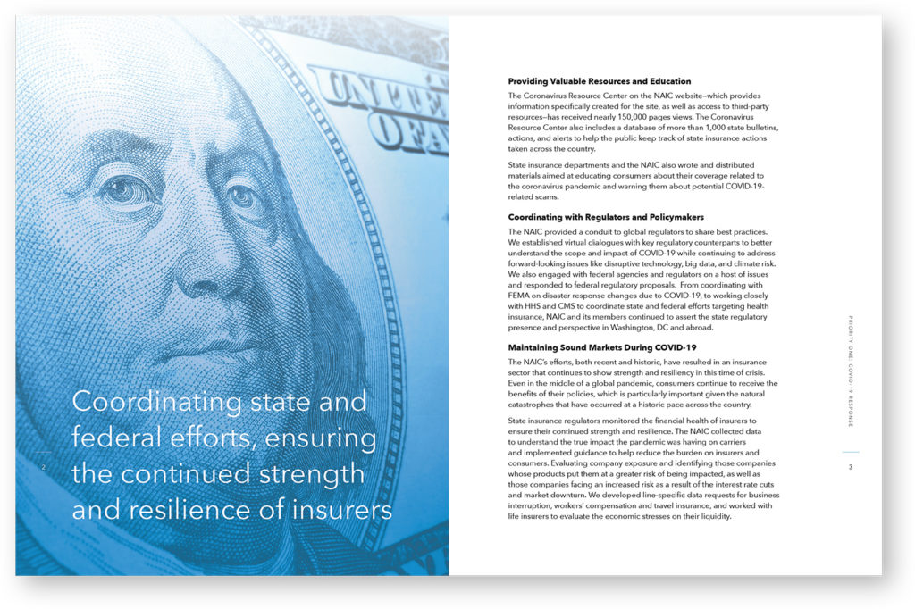
It is important to organize typography in a hierarchical system according to relative importance or inclusiveness through scale and function depending on communication.
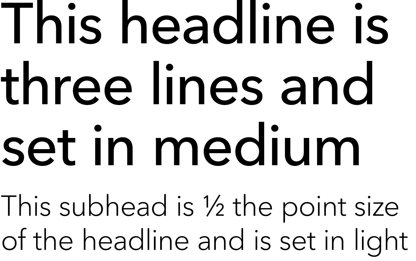
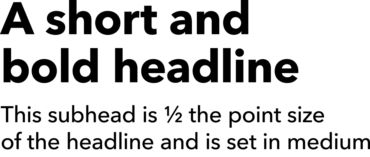
Headline
Avenir Next LT Pro Medium
Subhead
Avenir Next LT Pro Light
1/2 point size of headline
Headline
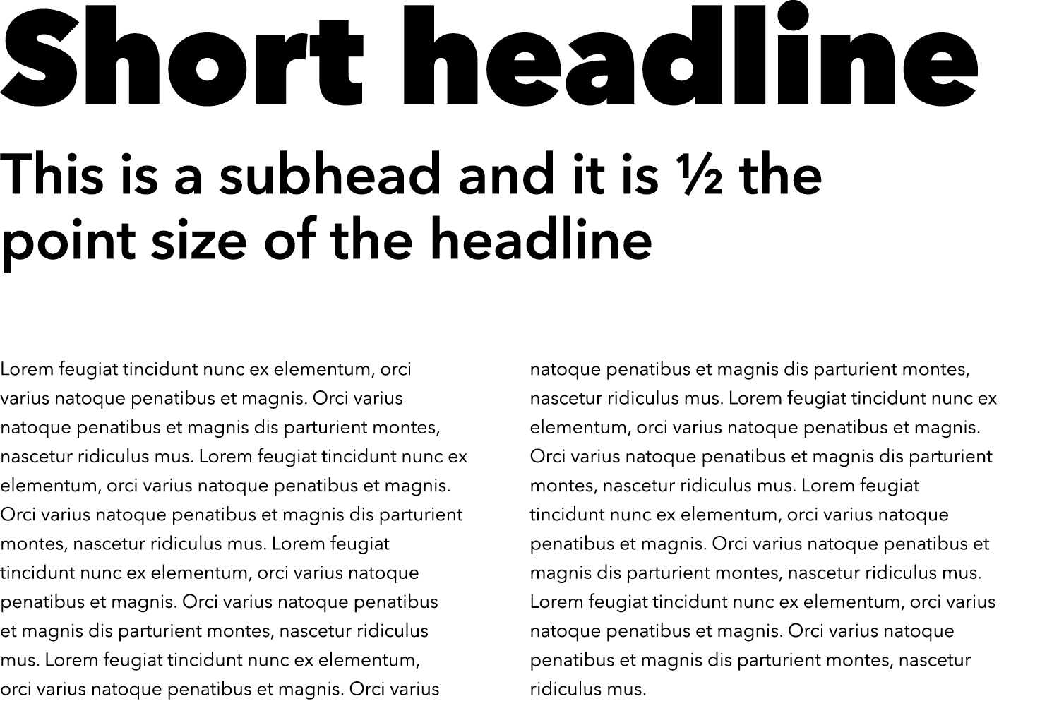
Avenir Next LT Pro Bold
Subhead
Avenir Next LT Pro Medium
1/2 point size of headline
Headline
Avenir Next LT Pro Heavy
Subhead
Avenir Next LT Pro Demi
1/2 point size of headline
Body copy
Avenir Next LT Pro Regular
1/3 point size of subhead
Headline
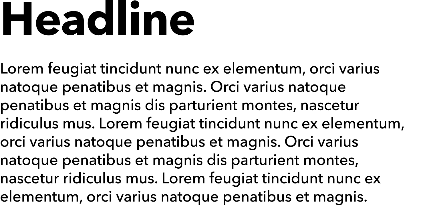
Avenir Next LT Pro Bold
Subhead
Avenir Next LT Pro Medium
1/3 point size of headline

Body copy section head
Avenir Next LT Pro Demi
Body copy
Avenir Next LT Pro Regular
same point size as section head

Body copy section head
Avenir Next LT Pro Demi
Body copy
Minion Pro Regular
same point size as section head
Typography Guidance
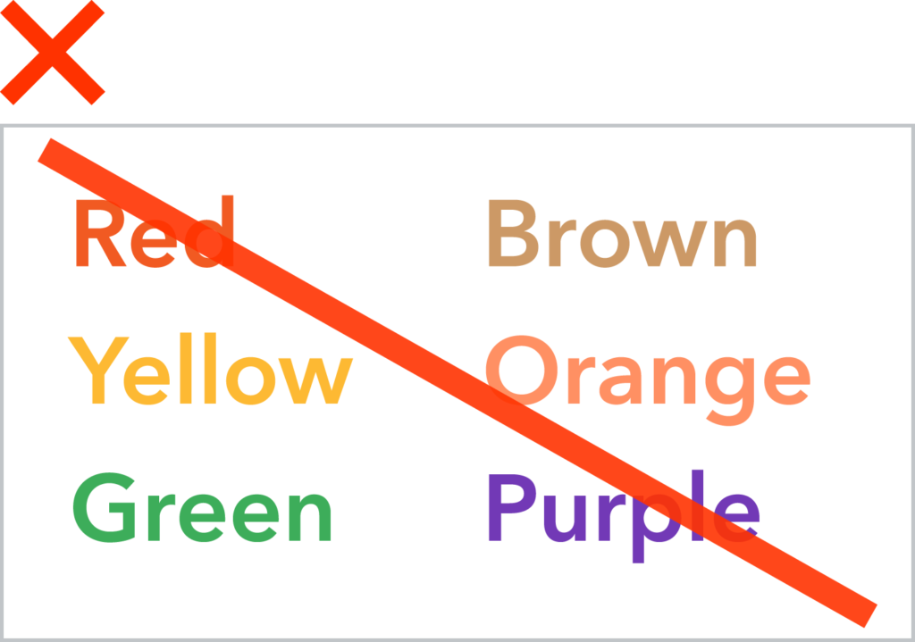
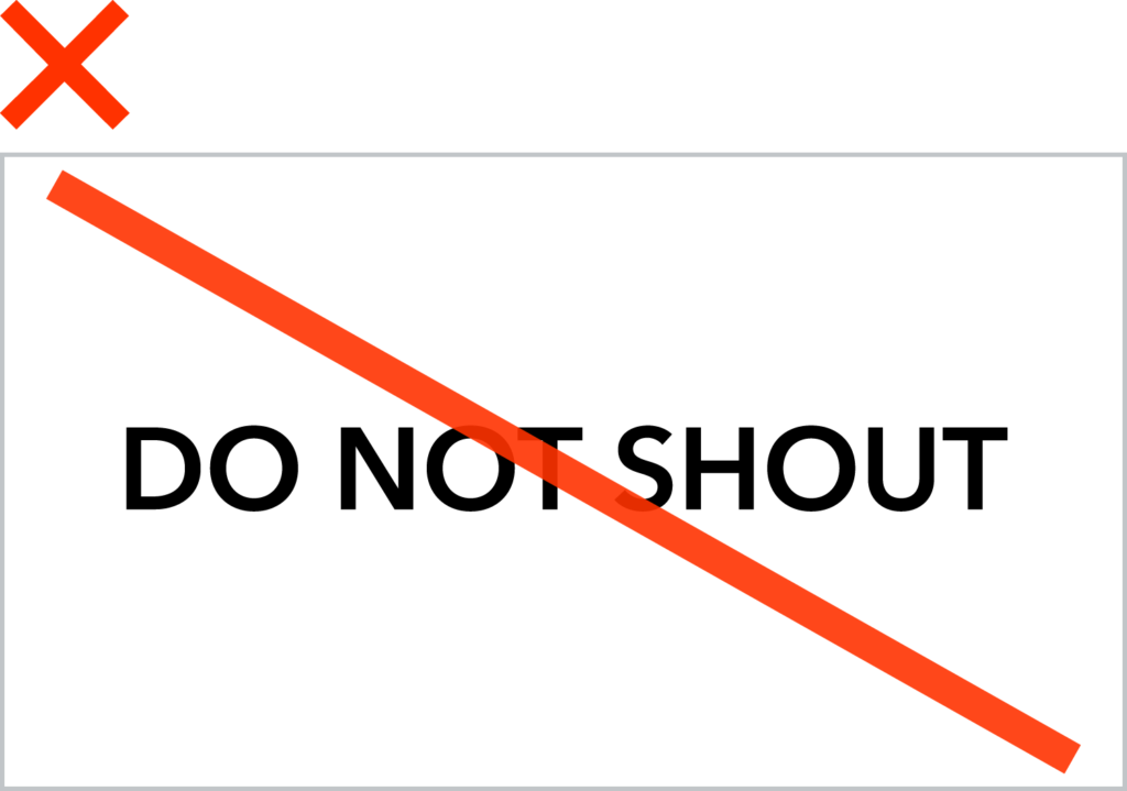
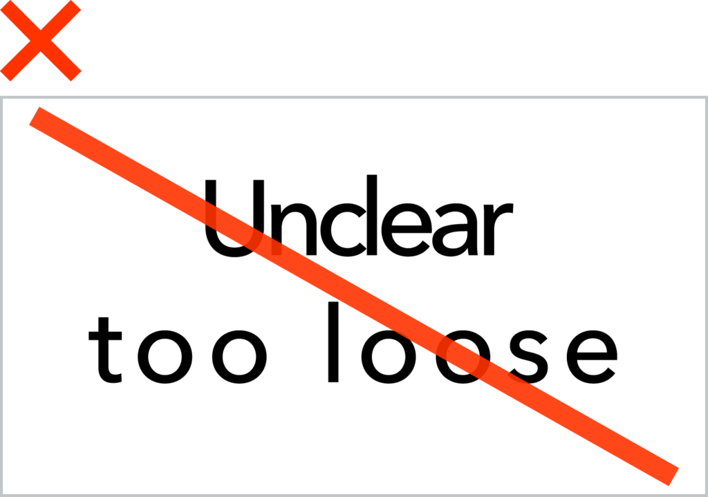
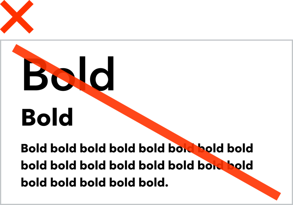
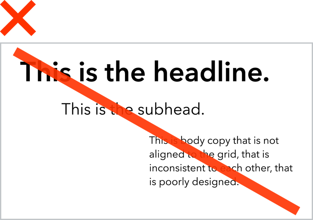
Things to Avoid:
Typography Summary
01
Our typeface keeps our branding focused and consistent
02
Aim for contrast across type hierarchies

